Add Your Heading Text Here

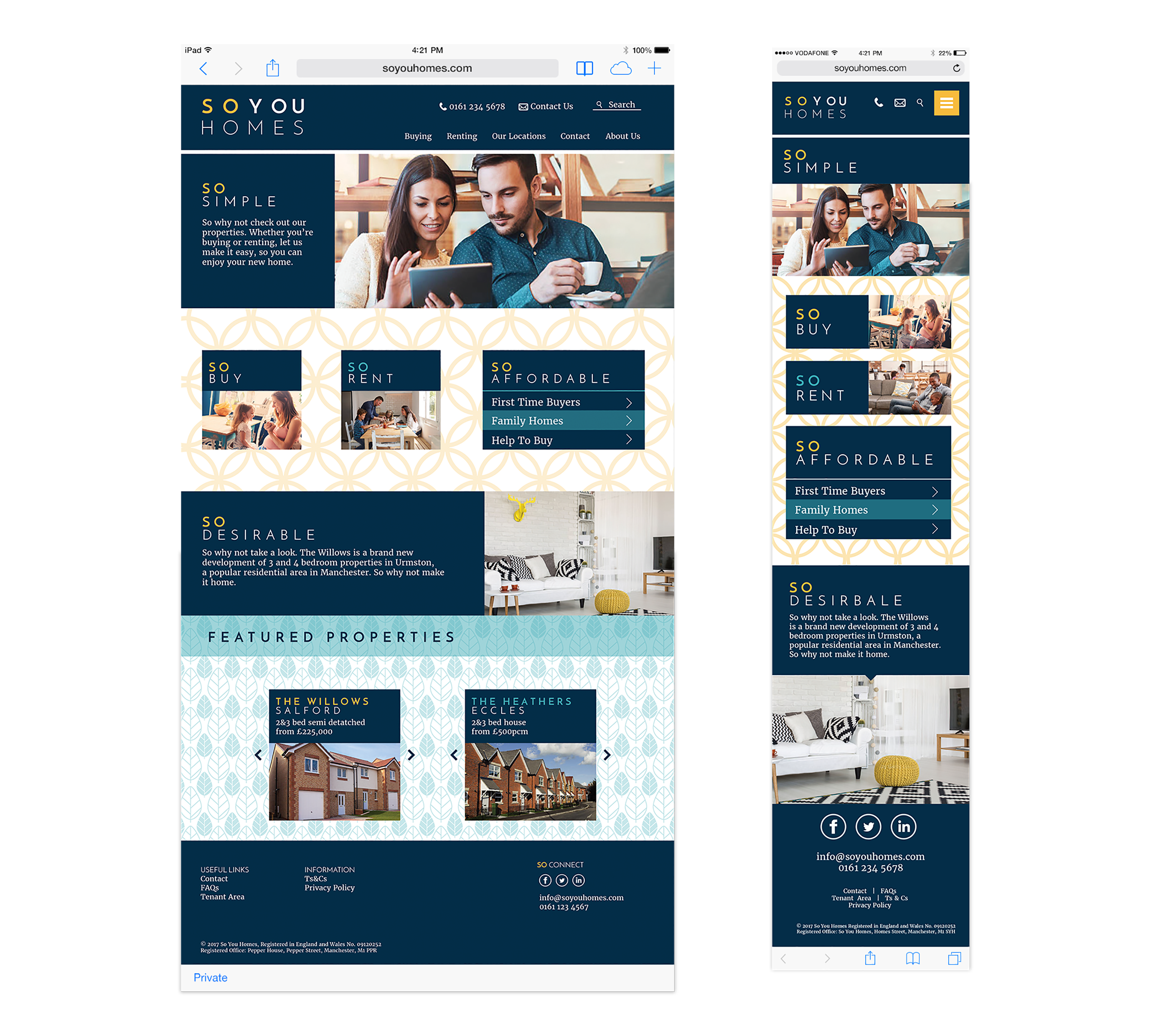
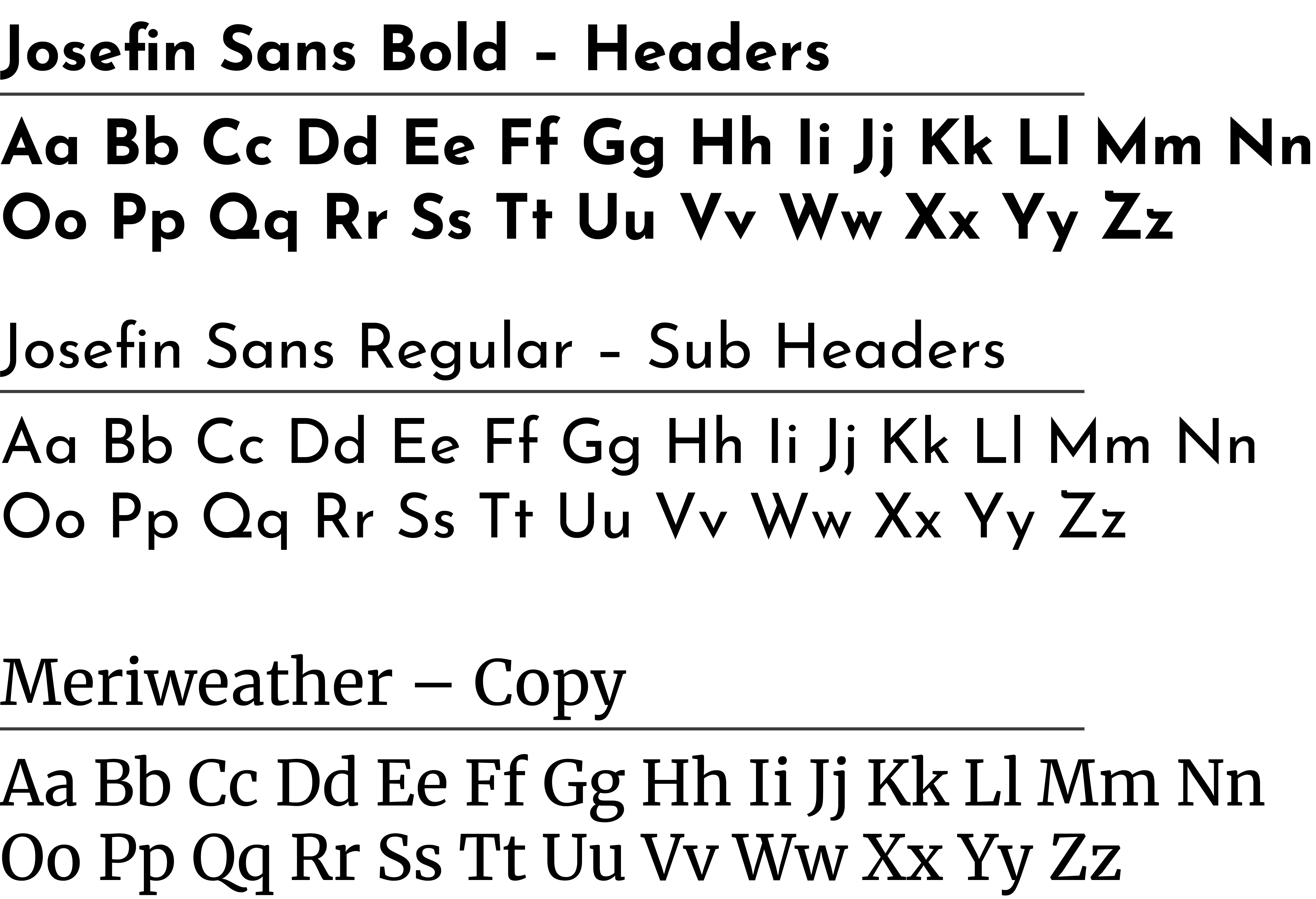
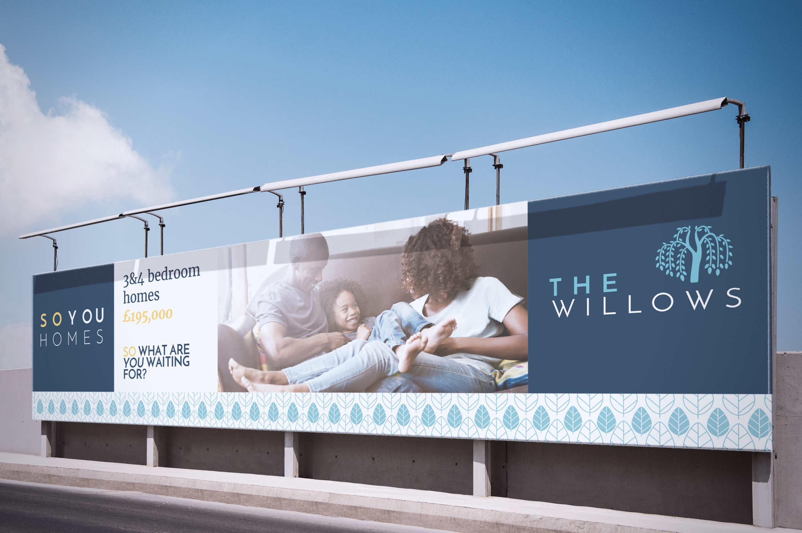
‘So You Homes’ is an estate agent operating primarily online and serving the Greater Manchester area who wanted their brand to reflect that they are personable, established and trustworthy. I used different patterns on for sale signs and throughout the website to be both eye catching and emphasise that the company and homes are unique. The colour palette helped to created the sense of an established, contemporary trustworthy company,  supported by the sans serif font.

CATEGORY Branding, Identity
CLIENT So You Homes
AGENCY C21 Creative
So You Homes logo in white upper case letters with yellow word 'So'
Set of stationery including business cards, folder and envelope for So You Homes branding
So You Homes website homepage shown on tablet and iphone
So you homes website home page desktop and mobile site

Colour Palette

Swatches with navy, yellow and light blue and also contemporary geometric patterns in the same colours

Typography

alphabets showing josefin sans bold and regular and meriweather fonts

Imagery

So You Homes To Let and For Sale Signs with patterned backgrounds
So You Homes For Sale Sign with patterned background, infront of house
So You Homes To Let Sign with patterned background, infront of house surrounded with bushes
So You homes hoarding on street showing family on dafe and advertising 3 and 4 bedroom homes for sale
hoarding advertising Sou You Homes The Willows housing development, featuring images of inside homes and a pattern of leaves running along the bottom