Add Your Heading Text Here
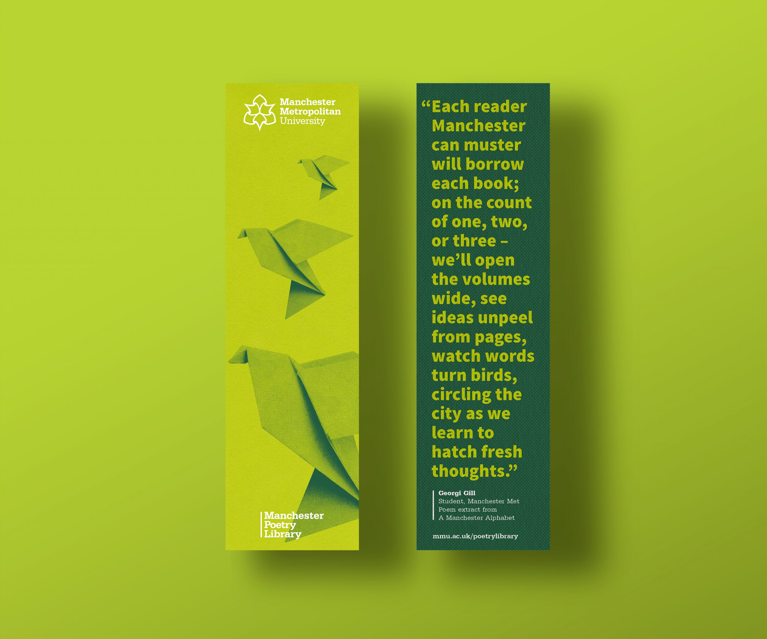
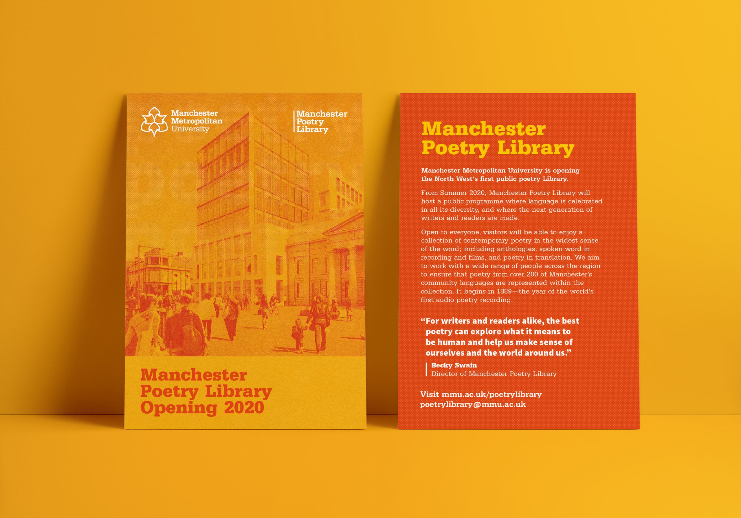
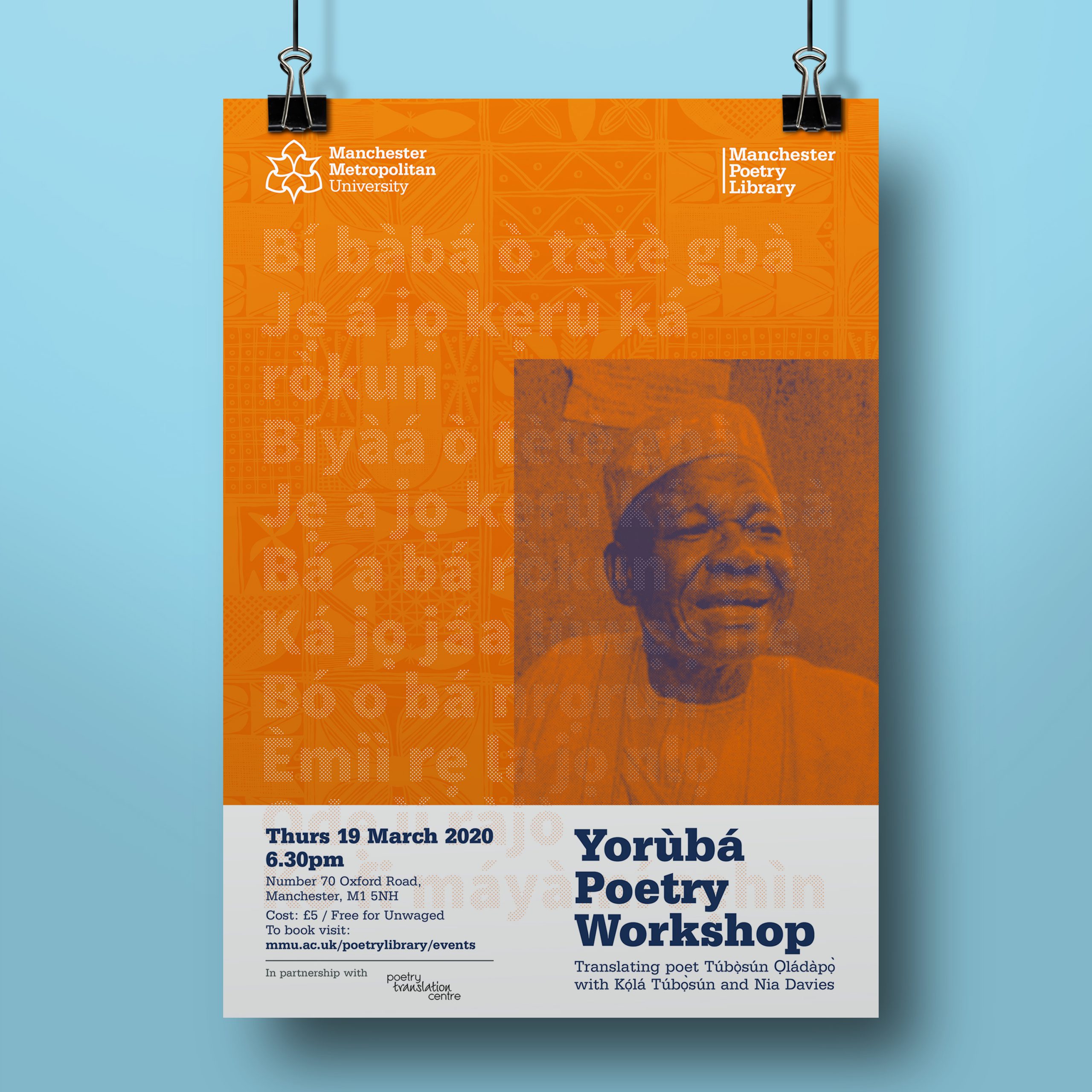
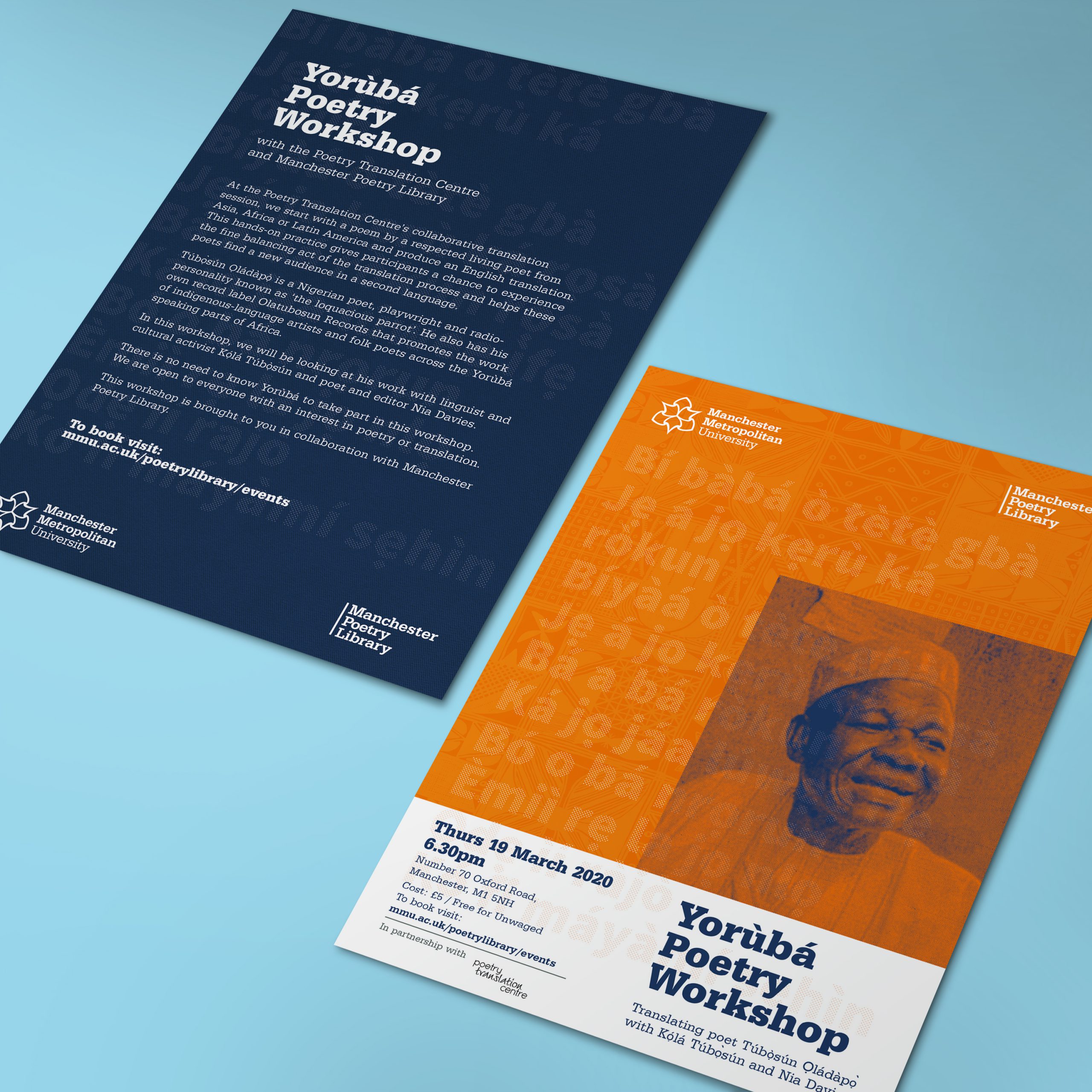
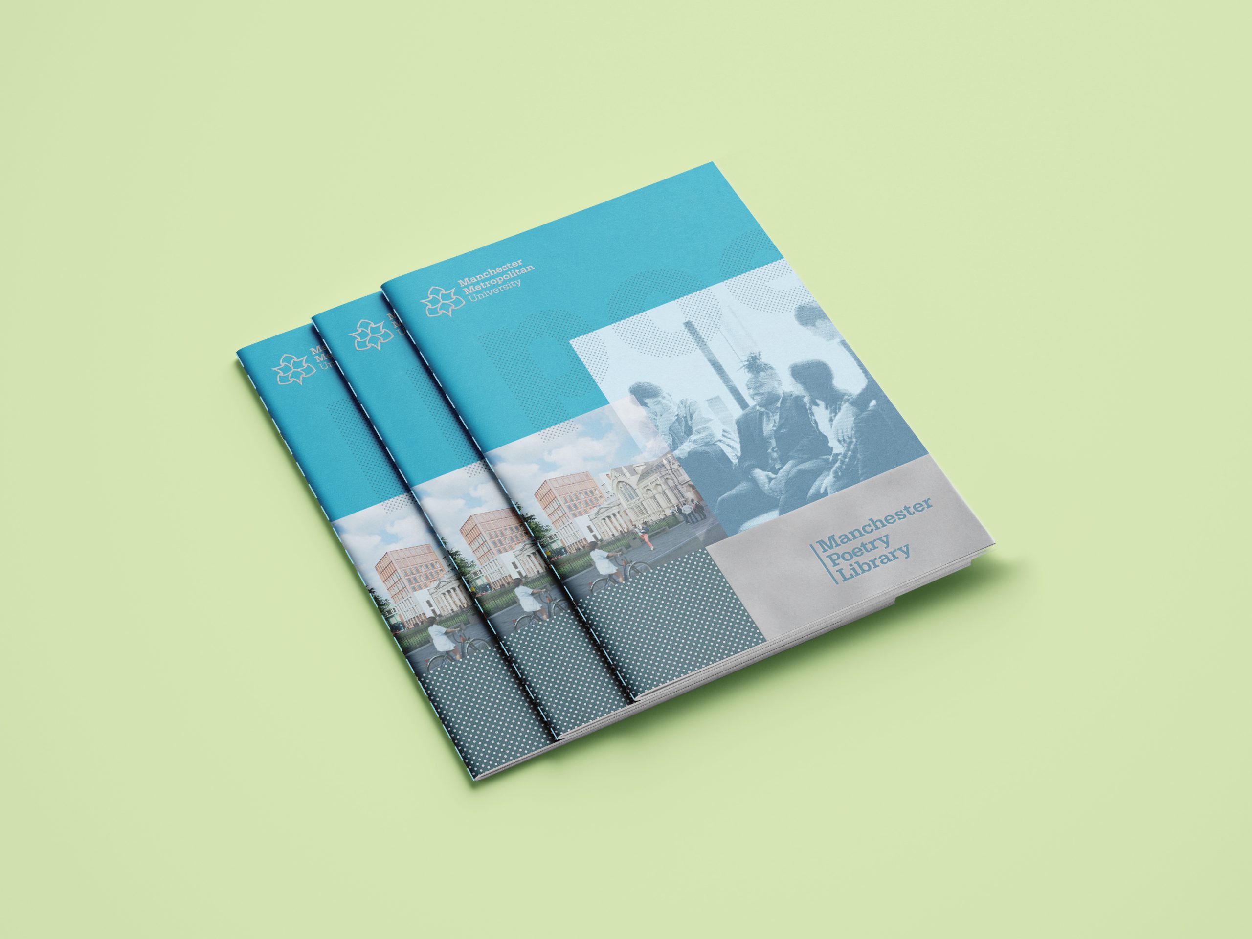
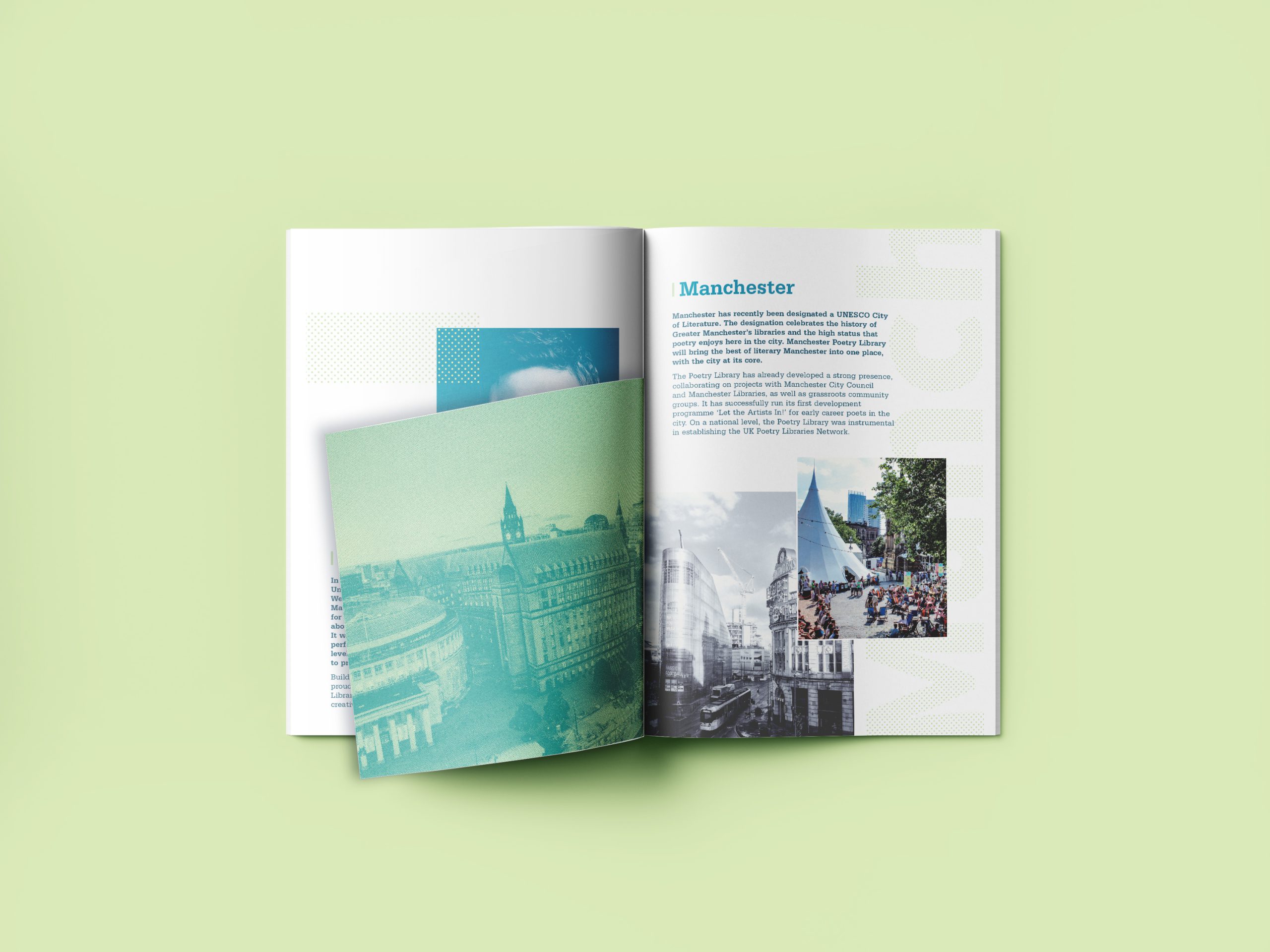
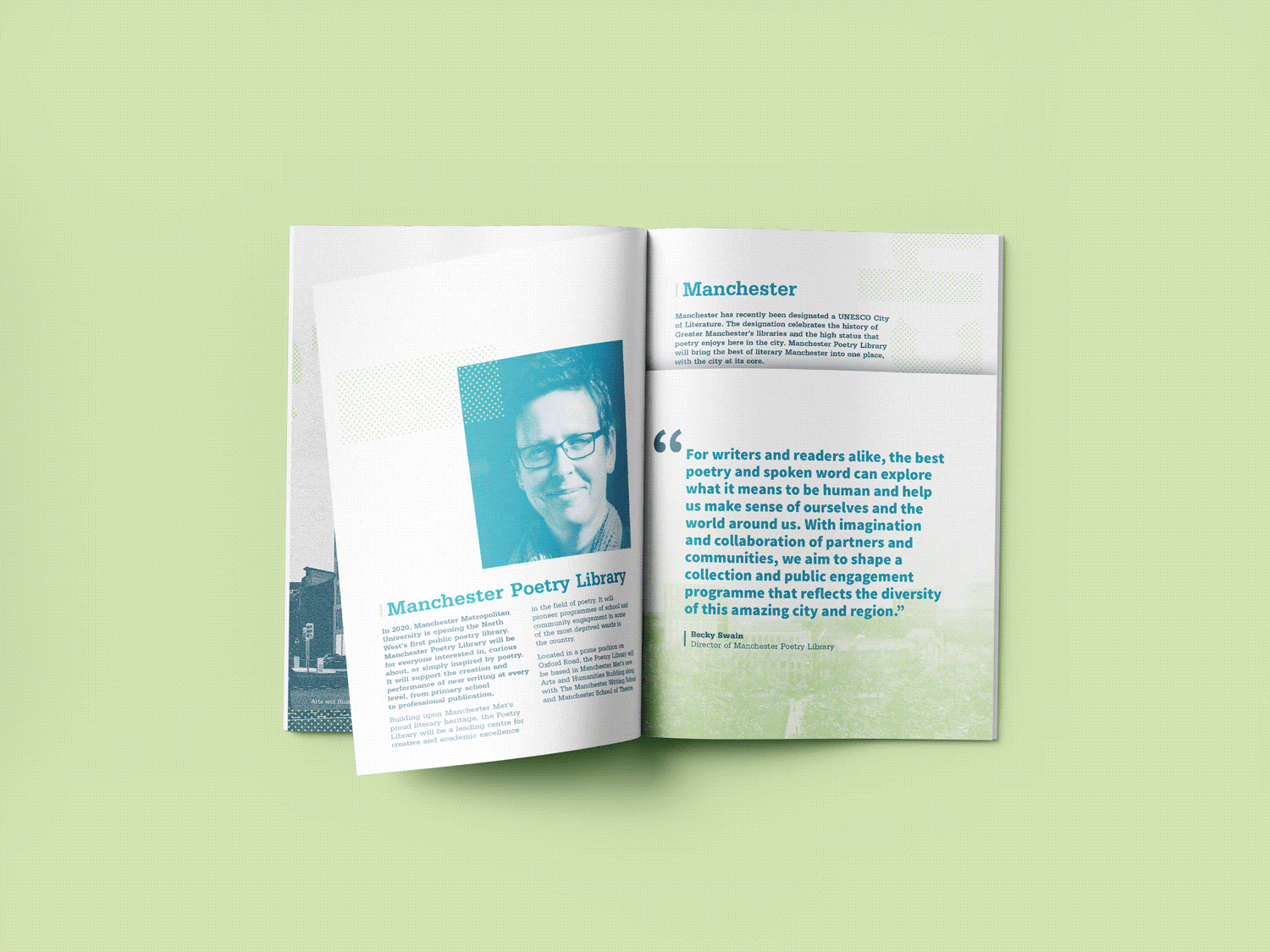
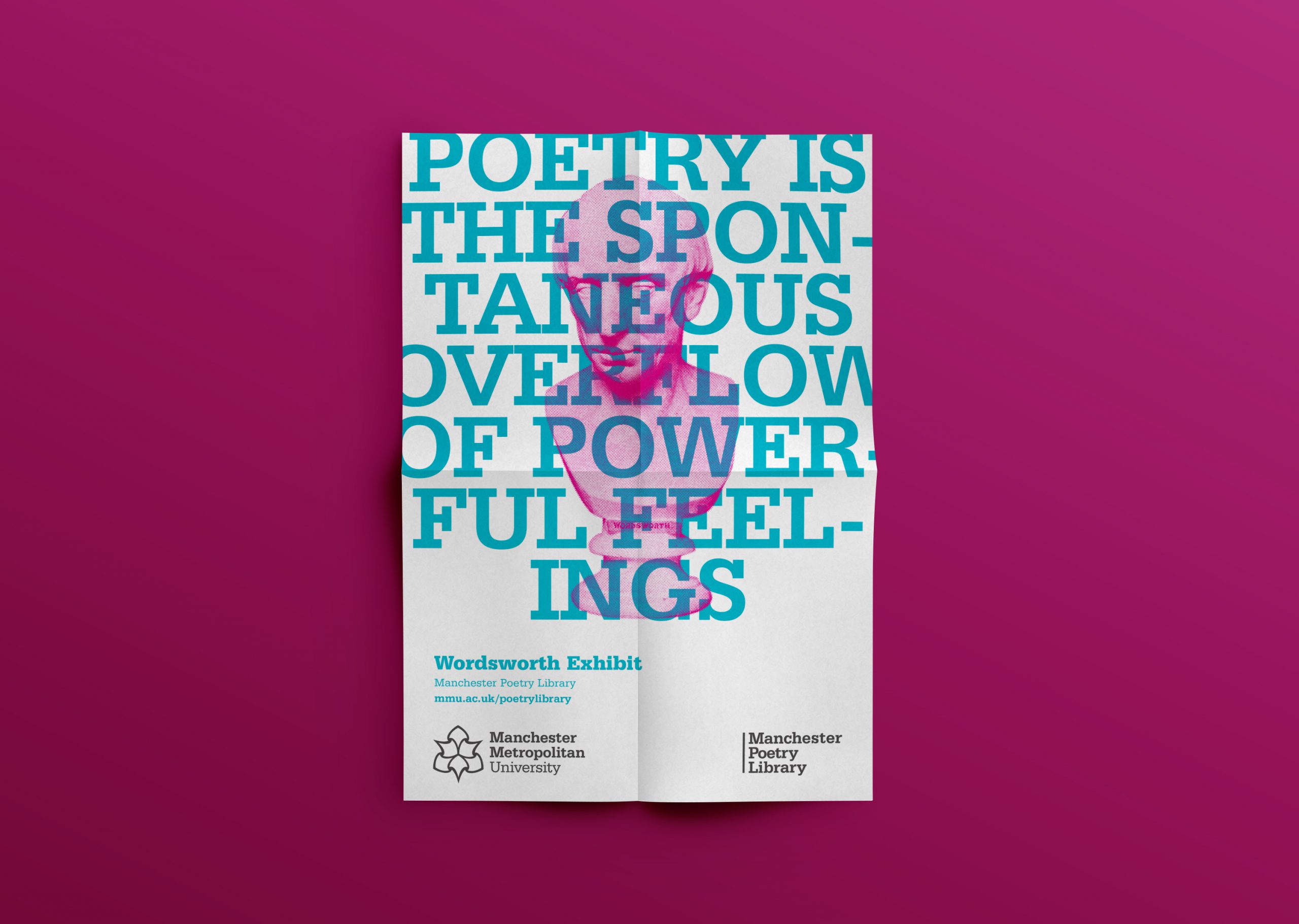
I was tasked with developing an identity that positions Manchester Poetry Library as a cultural resource regionally, nationally and internationally. Poetry is a diverse work in progress and I felt that the poetry library identity should be a reflection of this and embody Manchester as a city. The identity does this through a fluid and organic combination of bold typography, multicultural patterns, bright colours, and a mixture of conceptual and journalistic photography. This is knitted together with duotone and halftone effects, giving it a ‘real’ and tangible quality.
The mixture of abstract imagery, photography and pattern helps create a striking and interesting identity, at the same time reflecting the diversity, textile heritage, industry and edge of the city in which it resides.
I wanted the materials created to look and feel different, more tangible. The following brochure was designed to be slightly more reserved, being for a corporate audience of potential stakeholders and funders. I didn’t want it to lose its edginess however and achieved this balance through a more muted colour palette, combined with off size pages, and a stitched spine.
The imagery is a balanced mixture of urban edgy photography, shots of groups collaborating and more abstract or isolated imagery and patterns. It is vital that the imagery is not too clichéd, and maintains the diversity that the city has to offer.
Imagery
The identity can appear as a collage of imagery, or something more simple and yet still impactful. Language and words are something the poetry library celebrates, and it is only fitting that they make up an important part of this identity, appearing as bold quotes, dominating the design, or interwoven into the artwork itself.