Add Your Heading Text Here
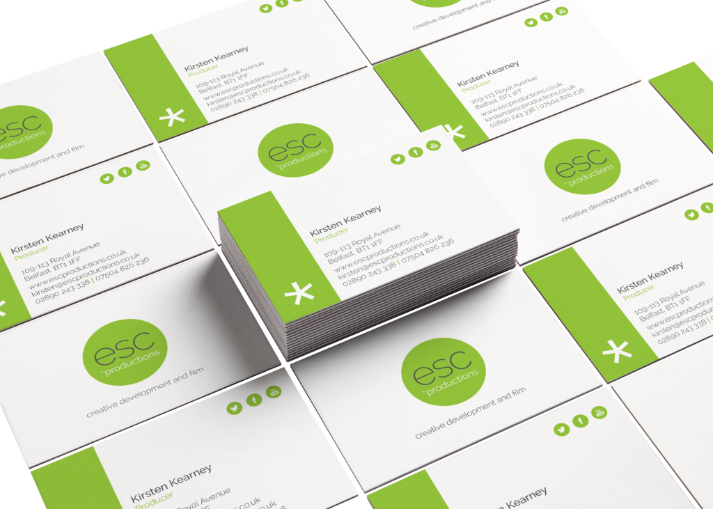
Having worked with its sister charity esc for some years now I was delighted to be asked to be involved in the branding and identity for esc*productions, a team of writers, directors, film-makers and designers who have made over 100 films to date. Their profits support esc’s transformative film-making work with marginalised people. My client wanted a vibrant fresh brand and I feel that the minimal look and vivid green works to achieve this, and also lends itself across the printed material I have produced to date.
CATEGORY Branding
CLIENT esc productions
AGENCY Freelance
The asterix in the logo is reference to to the fact they are the sister charity to esc films. This along with the vibrant colour and clean design are a symbol of the company’s ethos for giving people a new chance at life. esc productions launched one of its first pieces of work in collaboration with Barnardos.